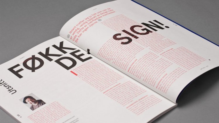
A typographic grid is a two-dimensional structure made up of a series of intersecting vertical and horizontal axes used to structure content. The grid serves as an armature on which a designer can organize text and images in a rational, easy to absorb manner.
Before the invention of movable type and printing, simple grids based on optimal proportions had been used to arrange handwritten text on pages. One such system, known as the Villard Diagram, was in use at least since medieval times.
After World War II, a number of graphic designers, including Max Bill, Emil Ruder, and Josef Müller-Brockmann, influenced by the modernist ideas of Jan Tschichold’s Die neue Typographie (The New Typography), began to question the relevance of the conventional page layout of the time. They began to devise a flexible system able to help designers achieve coherency in organizing the page.
The result was the modern typographic grid that became associated with the International Typographic Style. The seminal work on the subject, Grid systems in graphic design by Müller-Brockmann, helped propagate the use of the grid, first in Europe, and later in North America.
Reaction and reassessment
By the mid-1970s instruction of the typographic grid as a part of graphic design curricula had become standard in Europe, North America and much of Latin America. The graphic style of the grid was adopted as a look for corporate communication. In the early 1980s, a reaction against the entrenchment of the grid, particularly its dogmatic use, and association with corporate culture, resulted in some designers rejecting its use in favor of more organic structure.
The appearance of the Apple Macintosh computer, and the resulting transition away from type being set by typographers to designers setting type themselves resulted in a wave of experimentation, much of it contrary to the precepts of Tschichold and Müller-Brockmann. The typographic grid continues to be taught today, but more as a useful tool for some projects, not as a requirement or starting point for all page design.
While grid systems have seen significant use in print media, interest from web developers has only recently seen a resurgence. Website design frameworks producing HTML and CSS had existed for a while before newer frameworks popularised the use of grid-based layouts. Some grid systems specify fixed-width elements with pixels, and some are ‘fluid’, meaning that they call for page element sizing to be in relative units like percentages, rather than absolute units like pixels or points.
